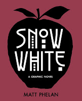
The scene: New York City. The dazzling lights cast shadows that grow ever darker as the glitzy prosperity of the Roaring Twenties screeches to a halt. Enter a cast of familiar characters: a young girl, Samantha White, returning after being sent away by her cruel stepmother, the Queen of the Follies, years earlier; her father, the King of Wall Street, who survives the stock market crash only to suffer a strange and sudden death; seven street urchins, brave protectors for a girl as pure as snow; and a mysterious stock ticker that holds the stepmother in its thrall, churning out ticker tape imprinted with the wicked words “Another . . . More Beautiful . . . KILL.” In a moody, cinematic new telling of a beloved fairy tale, extraordinary graphic novelist Matt Phelan captures the essence of classic film noir on the page—and draws a striking distinction between good and evil.
Award-winning graphic novelist Matt Phelan delivers a darkly stylized noir Snow White set against the backdrop of Depression-era Manhattan.
As you might expect from a book called Snow White, this graphic novel is a fairly faithful retelling of the popular fairy tale. The back story will be familiar: widowed father raises his daughter alone, then remarries – to a beautiful woman – who becomes increasingly jealous of the daughter. A “huntsman” is dispatched to kill the girl, but has a change of heart (punnnnnnnnnn). The daughter (Snow/Samantha), alone now, falls in with a group of seven little men (orphan boys), etc., etc. It’s all recognizable, and the ending is assured. So, why read this book?
The art, of course! Matt Phelan’s past work is award-winning, and he is no less talented in this volume. The mix of watercolor and pencil/ink line work is subtle, dark, and atmospheric. It fits this 1930s, noir-ish iteration of the fairy tale very well. While there aren’t any true plot surprises, the enjoyment is in the subtle changes, differences, and the play of dark and light through the lens of Depression-era New York City. I also LOVED the Art Deco typeset used on the front cover – actually the simplicity and design of the front cover may be my favorite thing about the book.
From the story, I liked that there’s a hint of uncertainty about whether it’s actually magic that the stepmother uses, or solely allure. I also thought the use of the ticker tape instead of the mirror on the wall was a clever substitution. The evil queen re-imagined as the star of the Ziegfeld Follies fit the time period, but the Follies and their context might not be familiar to readers in the intended age group. In some cases, that’s fine, because it will prompt research, but in this case it’s doubtful (tweaks to a familiar plot may trump interest in context).
Things I didn’t like: this story is very light on dialogue. Since this story will be familiar to many readers already, not a fatal flaw, but in parts it simply feels quiet, rather than menacing (which I’m going to hazard a guess is the intent of some of the panels, but certainly not all).
The second (and more substantial) criticism I had was from the point in the story where Snow White referred to opulent Christmastime department store window displays as a demonstration of ‘the magic of the city.’ The beautiful ‘magic’ of the displays in itself was not a problem – in fact, that window dressing is famous (and now traditional) and rightfully so. My issue was Snow’s audience: homeless boys who must huddle around a trash can fire for warmth, and to whom she was not offering (or able to offer) and real change in their circumstance. This juxtaposition lacked nuance and verged on needlessly cruel. Snow entreated them to find magic and beauty in something they could not have and would not have (at that point of the story), while they were struggling for survival. Some readers may not notice this scene, or dismiss it given later developments in the story, but to me it struck a tone of privilege.
In the end, Snow White is a beautifully illustrated, if not innovative, take on the popular fairy tale.
Recommended for: die-hard fans of fairy tales, and those with an eye to beautiful graphic novel design and illustration.


1 comment:
I tend to be kind of terrible at remembering which publishers or imprints I've been reading in. I do know Candlewick, because they rock and because they published Patrick Ness; and I know Balzer and Bray because someone mentioned to me that they tend to publish awesome stuff, and I've kind of noticed that too ever since. But that's maybe it? At least for imprints that I'm aware enough of that their name on a book is an enticement?
Post a Comment